


Next: BLAST - Basic Local
Up: FastA
Previous: FastA - Steps
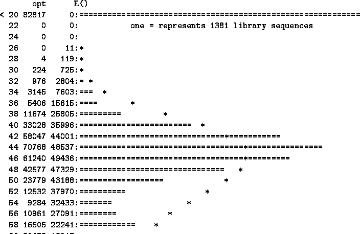
An Example of the FastA histogram is shown below:
Figure 5.3:
An example of the histogram in FastA Output
|
The X axis is the score,growing from top to bottom and printed on the left column .
The y axis shows the number of matching database records having the score.
The observed distribution of the score is plotted by bars of ``='' signs and printed in second column. The expected random distribution of the score is plotted by ``*'' signs and printed on the third column.
For example, a score of 34 was attained by 1045 sequences when the query was searched, compared to 1564 expected sequences with a random sequence search. This difference is visible at the corresponding histogram line: the '*' is not at the top of the '=' bar. Note, that on the bottom right a zoom is plotted, providing a closer look at the significant region.
following the graphic output of FastA.
Figure 5.4:
FastA output: The first lines contain general information about the search parameters. Score lines are made of nine rows: 1-3 details the name and the annotation of the hit, 4-9 are the FastA scores.
 |
Each Line describes one database sequence matching the query, printed in decreasing order of statistical significance. Each contains the name of the record, its database ID, a short description of it, the sequence length and the five FastA scores.
Although the statistical significance of a result can be evaluated directly from the E-score and Z-score, interpreting the row scores (
init1, initn and opt)may be useful:
- When
 homology over the matched stretch.
- When
initn > init1 more than one matching region was found in the database sequence with poorly matching separating regions.
- When
opt > initn the matching regions are greatly improved by adding gaps in one or both of the sequences.
Next: BLAST - Basic Local
Up: FastA
Previous: FastA - Steps
Peer Itsik
2000-12-11