


Next: Chooser Evaluation
Up: Evaluation of the Technique
Previous: Evaluation of the Technique
The predictor procedure was evaluated using both random and
non-random simulated networks. In random simulations acyclic
genetic networks of size N and maximum in-degree k were
randomly generated. The expression matrix E consisted of the
wild-type (without any nodes forced high or low) and all single
perturbations. In addition, a number of non-random networks,
modelled after known biological networks were simulated. For each
such network, the most parsimonious models were created by the
predictor.
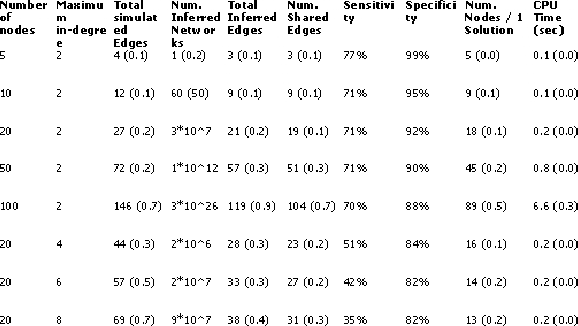
The similarity between each inferred network and its target was
evaluated with regard to sensitivity, defined as the
percentage of edges in the target network that were also present
in the inferred one, and specificity, defined as the
percentage of edges in the inferred network that were also present
in the target network. The following figures show the evaluation
results.
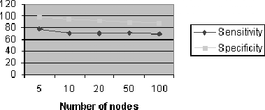
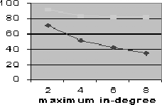
Each measurement is an average over 200 simulated target networks.
As one can see, the specificity was always significantly higher
than sensitivity, and both steadily decreased as N and k were
increased.
Figure 14.13:
Sencitivity and specificity vs. number of nodes
|
Figure 14.14:
Sencitivity and specificity vs. maximum in-degree
|
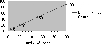
The number of nodes whose functions had only a single minimal
solution was approximately 90% for k=2, independent of N.
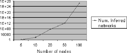
Thus although the number of inferred networks grew exponentially
with N, this number was consistently due to ambiguities at just
10% of the nodes.
Figure 14.15:
Percentage of networks with one solution
|
Figure 14.16:
Number of inferred networks vs. number of nodes.
|
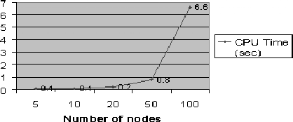
Figure 14.17:
CPU time vs. number of nodes.
|
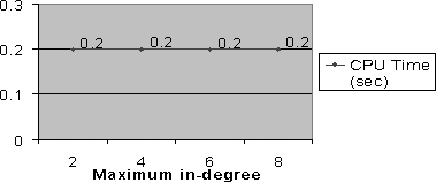
Figure 14.18:
CPU time vs. maximum in-degree.
|
Figure 14.19:
Summary of predictor evaluation.
|
Next: Chooser Evaluation
Up: Evaluation of the Technique
Previous: Evaluation of the Technique
Peer Itsik
2001-03-04